 |
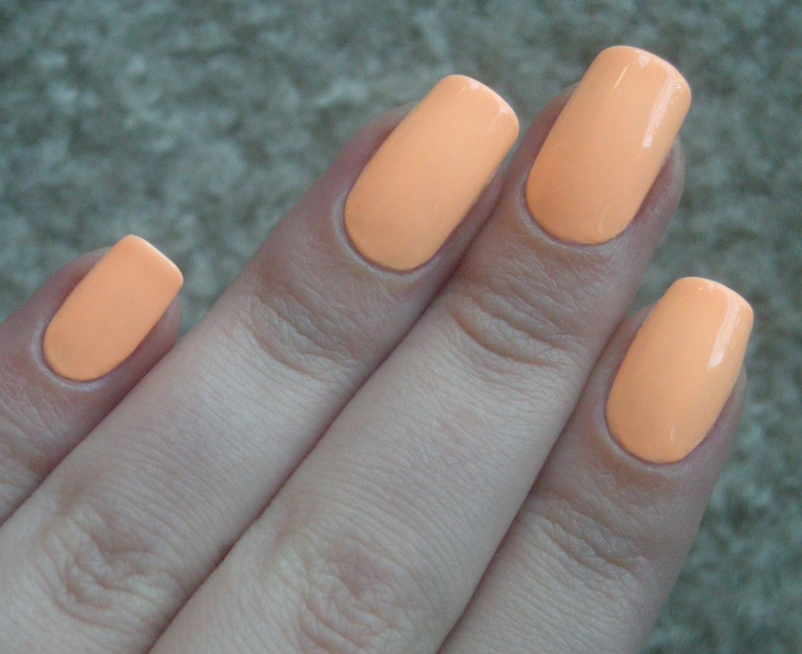
| 2 (thick) coats julie g 9 to 5 |
 |
| most color-accurate |

9 to 5 is a chameleon of a polish. in direct sunlight, it is seriously florescent, bordering on neon. makes my skin look grey and dead lol. but in softer lighting (like the picture above), it looks like a subtle peach pastel. hmmmmm. strange. i wasn't quite sure about this one, but you wouldn't believe how many compliments i got on it today and yesterday. i guess it's unique enough that it gets some attention?

i paid $3.99 for this at rite aid, which is a fair price for such an unusual shade. because of its neon-like tendencies, it was a little hard to apply. it's not thick or gooey or anything like that, but you have to do thick coats to keep it from dragging. and you definitely need top coat to smooth everything out. i'm ok with that, though, no big deal.
what i don't get is why it's called 9 to 5. . . . this, to me, is not exactly a work-friendly shade. i mean at my job, i can wear whatever i want, but in a super conservative office setting? neon pastel peach is probably not the best thing :P.

No comments:
Post a Comment